
More Than Just Pictures in a Row: The Gallery Module
How your images are presented often matters more than the images themselves.
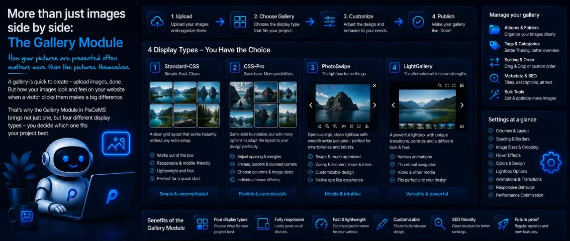
A gallery is quick to set up—upload some images, done. But how those images actually look and feel once a visitor clicks on one makes a real difference. That's exactly why the Gallery Module in PlaCeMS doesn't come with just one display style, but four—so you can decide which one fits your project.
People Judge with Their Eyes First
Text explains, images convince. Before a visitor even reads a single word on your page, their eyes have already formed a first impression—and that first impression often decides whether someone stays or clicks away.
This isn't just a matter of taste. Images communicate mood, quality, and trust faster than any text ever could. A craftsman who shows his work in sharp, well-presented photos automatically comes across as more professional than one who only describes what he does. A travel blog without atmospheric images loses much of its impact, no matter how well the text is written. An online shop where product photos are small, blurry, or crammed together carelessly feels unfinished—even if the product itself is excellent.
That's exactly why it's worth giving your image gallery more than just an afterthought, and instead deliberately deciding how it should look and feel. The Gallery Module in PlaCeMS hands you four different tools to do exactly that.
Standard CSS – Simple and Ready to Go Instantly
The standard display is exactly what the name promises: a clean, unobtrusive grid layout that works instantly, without any additional setup. Upload your images, activate the gallery, done—no configuring, no experimenting, no waiting.
That makes this option ideal for anyone who wants to get started quickly without first digging deep into styling options. For plenty of projects—a personal portfolio, a quick recap of an event, a simple product overview—this is already more than enough. Solid, tidy, and it works everywhere.
CSS Pro – Same Foundation, More Room to Design
CSS Pro builds on the same basic principle but gives you significantly more settings to fine-tune the layout to match your website's look—things like spacing, borders, corner rounding, or how the images are arranged.
The difference becomes especially noticeable when your website has a distinct design of its own—a particular color palette, rounded rather than sharp edges, generous or minimal whitespace. With default settings, a gallery can easily end up looking like a puzzle piece that doesn't quite fit. CSS Pro closes exactly that gap: the gallery blends in seamlessly instead of feeling like a bolted-on standard component that simply "works."
PhotoSwipe – The Lightbox for Life on the Go
When a visitor clicks on an image, PhotoSwipe opens a large, calm lightbox view—with swipe gestures that feel completely natural on a smartphone. A swipe left or right moves to the next image, a pinch zooms in, exactly the way people are used to from most good photo apps.
If you have a lot of mobile visitors—and these days, most websites do—this is a lightbox that feels like a native app experience, not like a bolted-on extra that only really works well with a mouse. Here too, several settings can be adjusted so the lightbox doesn't feel like a foreign element, but fits naturally into the rest of your page.
LightGallery – The Alternative with Its Own Strengths
LightGallery aims for a similar goal as PhotoSwipe—a large, focused image view on click—but brings its own transitions, controls, and overall feel to the table. Sometimes it's exactly that nuance that makes the difference: a slightly different transition effect, a different arrangement of controls, a style that better matches the visual language of a particular project.
LightGallery, too, can be adjusted through a range of settings to match your design, rather than settling for one fixed look. Whether PhotoSwipe or LightGallery ends up being the better fit is often a matter of personal feel—the easiest way to find out is to simply try both.
Which One Fits You?
A quick guide:
- Just want a solid gallery quickly, without any fuss? → Standard CSS
- Want the gallery to match your design exactly? → CSS Pro
- Have lots of mobile visitors and want an especially natural swipe feel? → PhotoSwipe
- Looking for a lightbox with a different visual style? → LightGallery
You don't have to commit forever—you can switch between display styles at any time as your requirements or design change.
Only If You Need It
Like every PlaCeMS module, the Gallery Module is completely optional. If you don't need an image gallery, it simply stays out of the picture—no unused code running anywhere in the background.
Four ways to show off your images—from simple to custom-tailored, from classic to mobile-optimized. Because people judge with their eyes first, and with PlaCeMS, you decide what they get to see.